本頁はFlutter.doc( https://docs.flutter.dev/ui/animations/hero-animations )のリファレンスブログです。
1.概要
ヒーローアニメーションは、2つの異なる画面間で UI 要素(主に画像等)を飛び移らせるアニメーションです。
(これにより、ユーザーがアイテムを選択した際に、そのアイテムが新しい詳細画面へスムーズに移行する視覚効果を作り出します。故に「共有要素遷移(Shared Element Transition)」と呼ばれることもあります。)
(1)説明項目
① Heroアニメーションを Flutter の Hero ウイジェット を使用して作成する方法
② 画像や要素を1つの画面から別の画面へ「飛ばす」方法
③ 要素が円形から長方形へと形状を変えながら、画面間を移動するアニメーションの作り方
(2)学習する Hero アニメーション
① Heroアニメーション例(標準型)
標準的なヒーローアニメーションは、ウィジェット(例えば画像やボタン)を現在のルートから新しいルートへと移動させるアニメーションです。
この際、ウィジェットは異なる場所に配置され、サイズも変更されることがあります。これにより、自然で連続した画面遷移が可能になり、ユーザーはアプリ内の動きに視覚的な一貫性を感じることができます。)
(例えば、中央に配置されたウィジェットをタップすると、新しいルートの左上に移動し、サイズが小さくなって表示されます。また、戻るボタンを押すか、デバイスの「戻る」ジェスチャーを使用すると、ウィジェットは元のルートに戻ります。)
動画や視覚的な例を通じて、こうしたヒーローアニメーションの動作がどのように行われるかがわかります。このアプローチにより、ユーザーが要素を操作した際に、次の画面へと移動しても、その要素が継続して表示されているように見えるため、ユーザー体験が向上します。
このようなアニメーションは、リストのアイテムやボタンなど、画面間で一貫した見た目と動きを維持する要素に対してよく使われます。
② Heroアニメーション例(放射型)
Radial hero animationは、ルート間を飛ぶ際にヒーローの形状が円形から長方形へ変わるアニメーションです。
(例えば、画面の下部に3つの円形画像がある場面を想像して下さい。そのうちの1つをタップすると、その画像は新しいルートへ飛び、そこで四角形の形として表示されます。逆に、四角形画像をタップすると、ヒーローは元のルートに戻り、円形の形で表示される、といったアニメーションです。)
このアニメーションは視覚的に興味深く、ユーザ体験を豊かにする効果があります。ユーザがタップすることで、画像が飛んで形を変えて表示されることで、インタラクティブでダイナミックな画面遷移が実現できます。
これにより、アニメーションの中でヒーローの形状が変わる様子を自然に演出でき、UI全体に一貫性と視覚的な魅力を加えることができます。
2.Hero アニメーションの基本構造
2.1 ポイント
ヒーローアニメーションを実装する際は、異なるルートに配置された2つの Hero ウィジェットを使用しますが、それらは同じタグで識別される必要があります。Navigator はアプリのルートを管理するスタックを持ち、ルートのプッシュ(遷移)やポップ(戻り)によってアニメーションがトリガーされます。
Flutter フレームワークは、RectTween を用いてヒーローの境界を計算し、アニメーション中にヒーローが出発地から到着地へ飛ぶ経路を定義します。アニメーション中、ヒーローはアプリケーションのオーバーレイに移動され、両方のルートの上に表示されるように見えます。
2.2 Hero アニメーションのコード構造
ヒーローアニメーションは、以下のような構造で実装されます。
Flutter は、出発地点から到達地点までのヒーローの境界をアニメーション化するトゥイーンを計算し、オーバーレイ内でアニメーションを実行します。
(これにより、ヒーローがルート間を飛んで移動するような視覚効果が得られます。)
- 開始時の Hero ウィジェット(ソースヒーロー) を定義します。
これは、グラフィカル表現(通常は画像)と識別タグを指定し、現在表示されているウィジェットツリーに含まれます。 - 終了時の Hero ウィジェット(デスティネーションヒーロー) を定義します。
これも同様にグラフィカル表現と同じタグを持つ必要があります。ソースヒーローとデスティネーションヒーローは、同じタグで作成されることが重要で、一般的に基礎となるデータを表すオブジェクトがタグとして使用されます。最良の結果を得るためには、これらのウィジェットツリーはほぼ同一であるべきです。 - デスティネーションルート を含むルートを作成します。
デスティネーションルートは、アニメーションの終了時に存在するウィジェットツリーを定義します。 - アニメーションをトリガーする為に、デスティネーションルートを Navigator のスタックにプッシュします。
Navigator のプッシュおよびポップ操作は、ソースルートとデスティネーションルートで一致するタグを持つヒーローのペアに対してアニメーションをトリガーします。
3. Hero アニメーションの背景にある仕組み
3.1 各プロセス内容
Flutterのドキュメントに基づくHeroアニメーションの説明では、ルート間でアニメーションの遷移がどのように行われるかの詳細を以下の様に解説しています。
(0)遷移前
遷移が開始する前は、元のヒーローが「ソースルート」のウィジェットツリーに存在しています。
デスティネーションルートはまだ存在せず、オーバーレイも空の状態です。
| (遷移元ルート) | (オーバーレイ) | (遷移先ルート) |
| 元Hero | 空 | 未 |
(1)デスティネーションルートがNavigatorにプッシュされたときに遷移が開始
Navigator に新しいルートをプッシュすることでアニメーションがトリガーされます。
この時点で(t=0.0)、Flutter は以下の操作を実行します。
| (遷移元ルート) | (オーバーレイ) | (遷移先ルート) |
| 元Hero | 元Hero | 未 |
- Material Motionの仕様に従って、カーブした動きで遷移先Heroのパスをオフスクリーンで計算します。
これにより、ヒーローがどこに到達するかをFlutterが把握します。 - 遷移先Hero をオーバーレイに配置し、その位置とサイズはソースヒーローと同じです。
このオーバーレイにヒーローを追加すると、Zオーダーが変更され、全ルートの上に表示される様になります。 - ソースヒーローはオフスクリーンに移動します。
(2)飛行中
ヒーローが飛行中には、Tweenを使用してその長方形の境界がアニメーション化されます。
Heroウィジェットの createRectTween プロパティによって指定され、デフォルトでは MaterialRectArcTween のインスタンスが使用され、反対側の角をカーブしたパスに沿ってアニメーション化します。
| (遷移元ルート) | (オーバーレイ) | (遷移先ルート) |
| 非表示(元Hero) | アニメーション (元Hero → 先Hero) | 未 |
(3)After transition
飛行が完了すると、Flutterはヒーローウィジェットをオーバーレイから遷移先ルートに移動させます。
オーバーレイは再び空になります。
遷移先ヒーローは最終位置に表示され、遷移元ヒーローは元のルートに戻されます。
| (遷移元ルート) | (オーバーレイ) | (遷移先ルート) |
| 元Hero? | 空 | 先Hero |
2.2 基本クラス
今回の例では、ヒーローアニメーションを実装するために以下のクラスが使用されています。
(1)Hero
ソースルートからデスティネーションルートへ飛ぶウィジェットです。
ソースルート用とデスティネーションルート用にそれぞれ1つのHeroを定義し、同じタグを割り当てます。
同じタグを持つヒーローペアをFlutterがアニメーション化します。
(2)InkWell
ヒーローをタップした際の動作を指定します。
InkWellのonTap()メソッドを使用して新しいルートを構築し、それをNavigatorのスタックにプッシュします。
(3)Navigator
ルートのスタックを管理します。
Navigatorのスタックにルートをプッシュまたはポップすると、アニメーションがトリガーされます。
(4)Route
画面やページを指定するクラスです。
基本的なアプリを超えて、多くのアプリは複数のルートを持っています。
3.Heroアニメーション例(Standard 標準型)
3.1 ポイント
ヒーローアニメーションでは、MaterialPageRoute、CupertinoPageRoute、またはPageRouteBuilderを使用してルートを指定します。
(このセクションの例ではMaterialPageRouteを使用しています。
アニメーション終了後に画像のサイズを変更するためには、遷移先の画像をSizedBoxでラップします。
また、画像の位置を変更するには、遷移先の画像をContainerのようなレイアウトウィジェットに配置します。)
3.2 標準的なヒーローアニメーションのコード
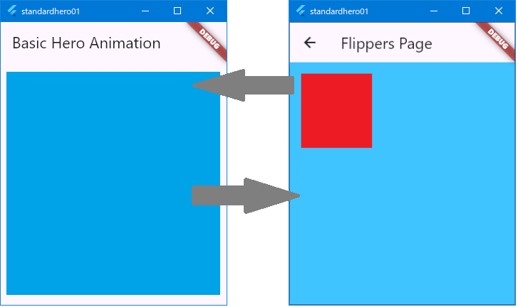
以下の例は、画像をあるルートから別のルートにアニメーションで飛ばす手法を示しています。
ガイドでは、最初の例の詳細について説明しています。
このアニメーションを実装することで、アプリケーション内で画像やウィジェットのアニメーション遷移を実現し、ユーザーに視覚的なコンテキストを維持したままスムーズな遷移体験を提供します。
- hero_animation:
PhotoHeroというカスタムウィジェットにヒーローコードをカプセル化し、Materialデザイン仕様に基づく曲線のパスに沿ってヒーローの動きをアニメーション化します。 - basic_hero_animation:
ヒーローウィジェットを直接使用します。
これは、よりシンプルな例として提供され、このガイドでは説明されていません。
3.2.1 Hero ウィジェットと MaterialPageRoute によるモーション
(1)モーション
参照:Understanding motion(https://m2.material.io/design/motion/understanding-motion.html#principles)
基本的なモーションは以下の通りです。
① Informative
モーションデザインは、要素間の関係、アクションの可否、アクションの結果を強調することで、ユーザーに情報を提供します。
② Focused
モーションにより、不要な気を散らすことなく、重要な点に注意を集中させることができます。
③ Expressive
モーションは、ユーザー ジャーニーの瞬間を祝い、一般的なインタラクションに特徴を加え、ブランドのスタイルを表現することができます。
(2)上記モーションの用途
A.Hierarchy(階層表現)
モーションは、トランジション内の要素がどのように関連しているかを示して、ユーザーの方向を把握するのに役立ちます。
B.Brand expression(ブランド表現)
volume_off Basil のスタイル化されたレシピ コンテンツは、視差や強調されたイージングを含むカスタマイズされたトランジションで伝えられます。トランジションの調整については、モーション システムのカスタマイズ セクションで詳しく説明します。
C.Icons and illustrations(アイコンやイラスト)
アイコン、イラスト、製品ロゴに微妙なアニメーションを加えることで、ユーザー エクスペリエンスに洗練さと遊び心を加えることができます。
D.Feedback and status(フィードバック提供やステータス通知)
モーションはタイムリなフィードバックを提供し、ユーザやシステムのアクションのステータスを示します。
E.User education(リテラシ向上)
モーションは、ユーザがアクションを実行する方法を理解するのに役立ちます。
(3)その他
F.The motion system(モーションシステム)
モーション システムは、ユーザがアプリを理解して操作するのに役立つ一連の遷移パターンです。
G.Speed(スピード)
スピード調整により、トランジションをスムーズで反応が良いものにできます。
H.Choreography(振舞い)
トランジション コレオグラフィーは、インターフェースが適応する間にユーザーの集中力を維持する調整されたモーション シーケンスです。
3.2.2 サンプルコード
・・・(前略)・・・

flutter:
  uses-materiiial-design: true

  assets:
    - assets/images/flippers-alpha.png
    - assets/images/flippers-beta.png

・・・(攻略)・・・//PhotoHero クラスと HeroAnimation クラスを含めた Flutter アプリ全体のコード
import 'package:flutter/material.dart';
import 'package:flutter/scheduler.dart' show timeDilation;
void main() => runApp(const MyApp());
//エントリーポイントとなる MyApp クラス
class MyApp extends StatelessWidget {
const MyApp({super.key});
@override
Widget build(BuildContext context) {
return MaterialApp(
title: 'Hero Animation Demo',
theme: ThemeData(
primarySwatch: Colors.blue,
),
home: const HeroAnimation(), //ホーム画面(HeroAnimation クラス)
);
}
}
//PhotoHero クラス:
//( 画像を Hero アニメーションで遷移させるためのカスタムウィジェット )
class PhotoHero extends StatelessWidget {
const PhotoHero({
super.key,
required this.photo,
this.onTap,
required this.width,
});
final String photo;
final VoidCallback? onTap;
final double width;
@override
Widget build(BuildContext context) {
return SizedBox(
width: width,
child: Hero(
tag: photo, // ヒーローアニメーションで共有されるタグ
child: Material(
color: Colors.transparent,
child: InkWell(
onTap: onTap,
child: Image.asset(
photo,
fit: BoxFit.contain,
),
),
),
),
);
}
}
//HeroAnimation クラス:
//( ソースとデスティネーションを持つアニメーションウィジェット )
class HeroAnimation extends StatelessWidget {
const HeroAnimation({super.key});
@override
Widget build(BuildContext context) {
timeDilation = 5.0; // 1.0 は通常のアニメーション速度。5.0 は遅延
return Scaffold(
appBar: AppBar(
title: const Text('Basic Hero Animation'),
),
body: Center(
child: PhotoHero(
//アセット画像1パス
photo: 'assets/images/flippers-beta.png',
width: 300.0, //アニメーション開始時の画像の幅
onTap: () {
Navigator.of(context).push(MaterialPageRoute<void>(
builder: (context) {
return Scaffold(
appBar: AppBar(
title: const Text('Flippers Page'),
),
body: Container(
color: Colors.lightBlueAccent, //背景色(新ルート強調)
padding: const EdgeInsets.all(16),
alignment: Alignment.topLeft,
child: PhotoHero(
//アセット画像2パス
photo: 'assets/images/flippers-alpha.png',
width: 100.0, //アニメーション終了時の画像の幅
onTap: () {
Navigator.of(context).pop(); //戻り時アニメーション
},
),
),
);
},
));
},
),
),
);
}
}4.Hero アニメーション例(3つの異なるRadial 放射状型サンプル)
ここでは、3つの異なる「放射状ヒーローアニメーション」が紹介されています。
なお、以下の3例はいずれも、pubspec.yaml の画像登録、images フォルダや直下の画像についても、共通です。
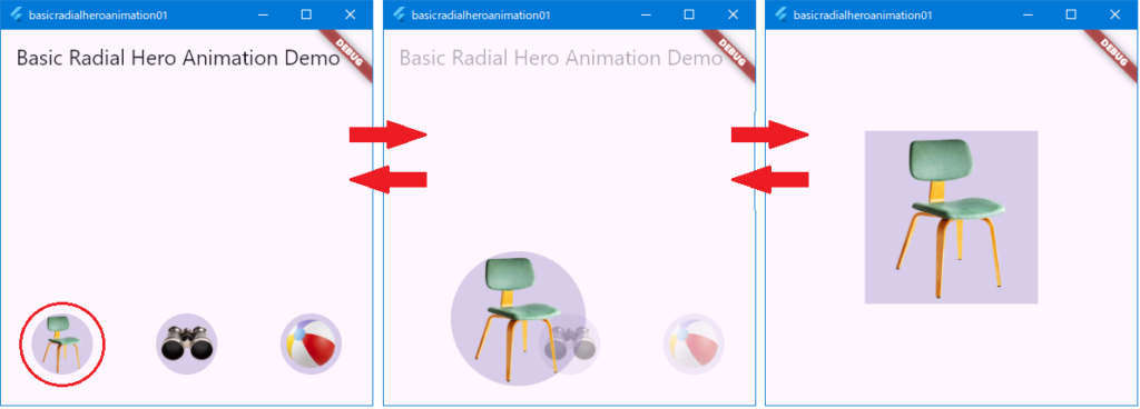
4.1 1例目(basic_radial_hero_animation)
放射状ヒーロー アニメーションの最も単純な例です。
(宛先ルートには、スキャフォールド、カード、列、テキストはありません。
この基本的な例は参考用に提供されており、このガイドでは説明されていません。)
//必要なパッケージをインポート
import 'dart:math' as math;
import 'package:flutter/material.dart';
import 'package:flutter/scheduler.dart' show timeDilation;
void main() {
// アプリのエントリーポイント。MaterialAppをラップしてRadialExpansionDemoをホーム画面に設定
runApp(
const MaterialApp(
home: RadialExpansionDemo(),
),
);
}
// 画像を表示するためのシンプルなウィジェット
class Photo extends StatelessWidget {
const Photo({super.key, required this.photo, this.color, this.onTap});
final String photo; // 画像のパス
final Color? color; // 背景色(オプション)
final VoidCallback? onTap; // タップ時のコールバック
@override
Widget build(BuildContext context) {
return Material(
// 背景に透明色を設定し、画像の透明部分が見えるようにする
color: Theme.of(context).primaryColor.withOpacity(0.25),
child: InkWell(
onTap: onTap, // タップ時の処理を指定
child: Image.asset(
photo, // 画像をアセットから読み込む
fit: BoxFit.contain, // 画像を収めるように調整
),
),
);
}
}
// 円形から矩形への拡大アニメーションを定義するウィジェット
class RadialExpansion extends StatelessWidget {
const RadialExpansion({
super.key,
required this.maxRadius, // 最大半径
this.child,
}) : clipRectExtent = 2.0 * (maxRadius / math.sqrt2); // クリップサイズの計算
final double maxRadius; // 最大半径
final double clipRectExtent; // クリップのサイズ
final Widget? child; // 内包する子ウィジェット
@override
Widget build(BuildContext context) {
// ClipOval は Hero ウィジェットの境界をマッチさせる
return ClipOval(
child: Center(
child: SizedBox(
width: clipRectExtent,
height: clipRectExtent,
child: ClipRect(
child: child, // 子ウィジェットをクリップ内に収める
),
),
),
);
}
}
// Radial Expansion アニメーションのデモを表示するウィジェット
class RadialExpansionDemo extends StatelessWidget {
const RadialExpansionDemo({super.key});
// 最小・最大の半径を設定
static double kMinRadius = 32;
static double kMaxRadius = 128;
// アニメーションの透明度の変化を定義
static Interval opacityCurve =
const Interval(0.0, 0.75, curve: Curves.fastOutSlowIn);
// アニメーションの経路を定義するRectTweenを作成
static RectTween _createRectTween(Rect? begin, Rect? end) {
return MaterialRectCenterArcTween(begin: begin, end: end);
}
// デスティネーションルートを構築
static Widget _buildPage(
BuildContext context, String imageName, String description) {
return Container(
color: Theme.of(context).canvasColor, // 背景色を設定
alignment: FractionalOffset.center, // 中央に配置
child: SizedBox(
width: kMaxRadius * 2.0,
height: kMaxRadius * 2.0,
child: Hero(
createRectTween: _createRectTween, // アニメーション経路を指定
tag: imageName, // タグでソースとデスティネーションをリンク
child: RadialExpansion(
maxRadius: kMaxRadius, // 最大半径を設定
child: Photo(
photo: imageName, // 表示する画像
onTap: () {
Navigator.of(context).pop(); // タップで戻る
},
),
),
),
),
);
}
// Hero ウィジェットを構築するメソッド
Widget _buildHero(
BuildContext context, String imageName, String description) {
return SizedBox(
width: kMinRadius * 2, // 最小半径のサイズ
height: kMinRadius * 2,
child: Hero(
createRectTween: _createRectTween,
tag: imageName,
child: RadialExpansion(
maxRadius: kMaxRadius,
child: Photo(
photo: imageName,
onTap: () {
Navigator.of(context).push(
PageRouteBuilder<void>(
pageBuilder: (context, animation, secondaryAnimation) {
return AnimatedBuilder(
animation: animation, // アニメーションを設定
builder: (context, child) {
return Opacity(
opacity: opacityCurve.transform(animation.value),
child: _buildPage(context, imageName, description),
);
},
);
},
),
);
},
),
),
),
);
}
@override
Widget build(BuildContext context) {
timeDilation = 20.0; // アニメーションをスローにする
return Scaffold(
appBar: AppBar(
title: const Text('Basic Radial Hero Animation Demo'),
),
body: Container(
padding: const EdgeInsets.all(32), // パディングを設定
alignment: FractionalOffset.bottomLeft, // 配置の調整
child: Row(
mainAxisAlignment: MainAxisAlignment.spaceBetween, // コンテンツを左右に配置
children: [
_buildHero(context, 'images/chair-alpha.png', 'Chair'),
_buildHero(context, 'images/binoculars-alpha.png', 'Binoculars'),
_buildHero(context, 'images/beachball-alpha.png', 'Beach ball'),
],
),
),
);
}
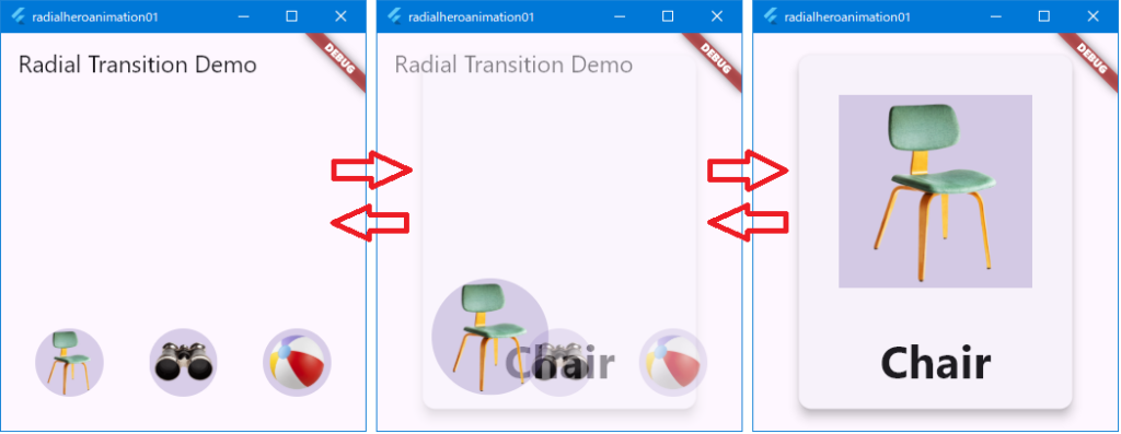
}4.2 2例目(radial_hero_animation)
マテリアル モーション仕様で説明されている放射状のヒーロー アニメーション。
import 'dart:math' as math;
import 'package:flutter/material.dart';
import 'package:flutter/scheduler.dart' show timeDilation;
void main() {
// アプリのエントリーポイント。MaterialAppをラップしてRadialExpansionDemoをホーム画面に設定
runApp(
const MaterialApp(
home: RadialExpansionDemo(),
),
);
}
// 画像を表示するためのシンプルなウィジェット
class Photo extends StatelessWidget {
const Photo({super.key, required this.photo, this.onTap});
final String photo; // 表示する画像のパス
final VoidCallback? onTap; // タップ時のコールバック
@override
Widget build(BuildContext context) {
return Material(
// 背景にわずかな透明色を設定して、画像が透明な部分で透過するようにする
color: Theme.of(context).primaryColor.withOpacity(0.25),
child: InkWell(
onTap: onTap, // タップ時にonTapコールバックを呼び出す
child: LayoutBuilder(
builder: (context, size) {
return Image.asset(
photo, // 画像をアセットから読み込む
fit: BoxFit.contain, // 画像を収めるように調整
);
},
),
),
);
}
}
// 円形の拡大アニメーションを定義するウィジェット
class RadialExpansion extends StatelessWidget {
const RadialExpansion({
super.key,
required this.maxRadius, // 最大半径
this.child,
}) : clipRectSize = 2.0 * (maxRadius / math.sqrt2); // クリップサイズを計算
final double maxRadius; // 最大半径
final double clipRectSize; // クリップする矩形のサイズ
final Widget? child; // 内包する子ウィジェット
@override
Widget build(BuildContext context) {
return ClipOval(
child: Center(
child: SizedBox(
width: clipRectSize,
height: clipRectSize,
child: ClipRect(
child: child, // 子ウィジェットをクリップ内に収める
),
),
),
);
}
}
// Radial Expansionアニメーションのデモを表示するメインウィジェット
class RadialExpansionDemo extends StatelessWidget {
const RadialExpansionDemo({super.key});
// 最小・最大半径を定義
static double kMinRadius = 32.0;
static double kMaxRadius = 128.0;
// アニメーション中の透明度の変化を定義
static Interval opacityCurve =
const Interval(0.0, 0.75, curve: Curves.fastOutSlowIn);
// RectTweenを作成して、円形アニメーションの経路を定義
static RectTween _createRectTween(Rect? begin, Rect? end) {
return MaterialRectCenterArcTween(begin: begin, end: end);
}
// デスティネーションルートを作成するメソッド
static Widget _buildPage(
BuildContext context, String imageName, String description) {
return Container(
color: Theme.of(context).canvasColor, // 背景色を設定
child: Center(
child: Card(
elevation: 8, // カードに影を追加
child: Column(
mainAxisSize: MainAxisSize.min, // 子要素に合わせたサイズに設定
children: [
// Heroウィジェットを使用してアニメーションを定義
SizedBox(
width: kMaxRadius * 2.0,
height: kMaxRadius * 2.0,
child: Hero(
createRectTween: _createRectTween,
tag: imageName, // タグを指定して、ソースとデスティネーションを一致させる
child: RadialExpansion(
maxRadius: kMaxRadius,
child: Photo(
photo: imageName, // 画像パスを渡す
onTap: () {
Navigator.of(context).pop(); // タップで戻る
},
),
),
),
),
Text(
description, // 説明テキストを表示
style: const TextStyle(fontWeight: FontWeight.bold),
textScaler: const TextScaler.linear(3),
),
const SizedBox(height: 16), // スペースを追加
],
),
),
),
);
}
// Heroウィジェットを構築するメソッド
Widget _buildHero(
BuildContext context,
String imageName,
String description,
) {
return SizedBox(
width: kMinRadius * 2.0,
height: kMinRadius * 2.0,
child: Hero(
createRectTween: _createRectTween,
tag: imageName, // タグを設定してHeroウィジェット間をリンク
child: RadialExpansion(
maxRadius: kMaxRadius,
child: Photo(
photo: imageName, // 表示する画像を指定
onTap: () {
// 新しいルートをナビゲートしてプッシュ
Navigator.of(context).push(
PageRouteBuilder<void>(
pageBuilder: (context, animation, secondaryAnimation) {
return AnimatedBuilder(
animation: animation,
builder: (context, child) {
return Opacity(
opacity: opacityCurve.transform(animation.value),
child: _buildPage(context, imageName, description),
);
},
);
},
),
);
},
),
),
),
);
}
@override
Widget build(BuildContext context) {
timeDilation = 5.0; // アニメーション速度を遅くしてデバッグしやすくする
return Scaffold(
appBar: AppBar(
title: const Text('Radial Transition Demo'),
),
body: Container(
padding: const EdgeInsets.all(32),
alignment: FractionalOffset.bottomLeft, // 配置の調整
child: Row(
mainAxisAlignment: MainAxisAlignment.spaceBetween, // アイテムを左右に配置
children: [
_buildHero(context, 'images/chair-alpha.png', 'Chair'), // 画像ごとにHeroを構築
_buildHero(context, 'images/binoculars-alpha.png', 'Binoculars'),
_buildHero(context, 'images/beachball-alpha.png', 'Beach ball'),
],
),
),
);
}
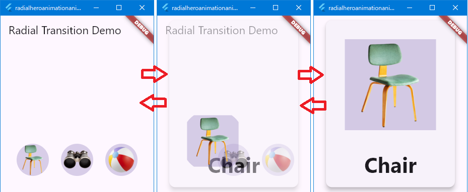
}4.3 3例目(radial_hero_animation_animate_rectclip)
長方形クリップのサイズもアニメーション化することで、radial_hero_animation を拡張しています。
(このより高度な例は参考用であり、このガイドでは説明されていません。)
// 必要なパッケージをインポート
import 'dart:math' as math;

import 'package:flutter/material.dart';
import 'package:flutter/scheduler.dart' show timeDilation;

void main() {
  // アプリのエントリーポイント。MaterialAppを使ってRadialExpansionDemoをホーム画面として設定
  runApp(
    const MaterialApp(
      home: RadialExpansionDemo(),
    ),
  );
}

// 写真を表示するためのウィジェット
class Photo extends StatelessWidget {
  const Photo({super.key, required this.photo, this.onTap});

  final String photo; // 画像ファイルのパス
  final VoidCallback? onTap; // タップ時のアクション

  @override
  Widget build(BuildContext context) {
    return Material(
      // 背景にやや透過の色を追加。画像が透明な部分で見えるようにする
      color: Theme.of(context).primaryColor.withOpacity(0.25),
      child: InkWell(
        onTap: onTap, // タップ時の動作
        child: LayoutBuilder(
          builder: (context, size) {
            return Image.asset(
              photo, // アセットから画像を読み込む
              fit: BoxFit.contain, // コンテナ内で画像を適切に調整
            );
          },
        ),
      ),
    );
  }
}

// 円形から矩形への拡大を実現するウィジェット
class RadialExpansion extends StatelessWidget {
  RadialExpansion({
    super.key,
    required this.minRadius, // 最小半径
    required this.maxRadius, // 最大半径
    this.child,
  }) : clipTween = Tween<double>(
          begin: 2.0 * minRadius, // クリップの開始サイズ
          end: 2.0 * (maxRadius / math.sqrt2), // クリップの終了サイズ
        );

  final double minRadius; // 最小半径
  final double maxRadius; // 最大半径
  final Tween<double> clipTween; // アニメーションのサイズ変化
  final Widget? child; // 内包する子ウィジェット

  @override
  Widget build(BuildContext context) {
    return LayoutBuilder(
      builder: (context, size) {
        // アニメーションの進行度を計算
        final double t =
            (size.biggest.width / 2.0 - minRadius) / (maxRadius - minRadius);
        final double rectClipExtent = clipTween.transform(t);
        return ClipOval(
          child: Center(
            child: SizedBox(
              width: rectClipExtent, // 幅をアニメーションに基づいて設定
              height: rectClipExtent, // 高さをアニメーションに基づいて設定
              child: ClipRect(
                child: child, // 子ウィジェットをクリップ内に収める
              ),
            ),
          ),
        );
      },
    );
  }
}

// Radial Expansion アニメーションのデモを表示するウィジェット
class RadialExpansionDemo extends StatelessWidget {
  const RadialExpansionDemo({super.key});

  // 最小・最大の半径を設定
  static const double kMinRadius = 32.0;
  static const double kMaxRadius = 128.0;
  // 透明度の変化を設定
  static const opacityCurve = Interval(0.0, 0.75, curve: Curves.fastOutSlowIn);

  // アニメーションの経路を定義するRectTweenを作成
  RectTween _createRectTween(Rect? begin, Rect? end) {
    return MaterialRectCenterArcTween(begin: begin, end: end);
  }

  // デスティネーションページを構築
  Widget _buildPage(BuildContext context, String imageName, String description) {
    return Container(
      color: Theme.of(context).canvasColor, // 背景色を設定
      child: Center(
        child: Card(
          elevation: 8, // カードの影を追加
          child: Column(
            mainAxisSize: MainAxisSize.min,
            children: [
              SizedBox(
                width: kMaxRadius * 2.0,
                height: kMaxRadius * 2.0,
                child: Hero(
                  createRectTween: _createRectTween, // アニメーション経路を指定
                  tag: imageName, // タグでソースとデスティネーションをリンク
                  child: RadialExpansion(
                    minRadius: kMinRadius, // 最小半径を設定
                    maxRadius: kMaxRadius, // 最大半径を設定
                    child: Photo(
                      photo: imageName, // 表示する画像
                      onTap: () {
                        Navigator.of(context).pop(); // タップで戻る
                      },
                    ),
                  ),
                ),
              ),
              Text(
                description,
                style: const TextStyle(fontWeight: FontWeight.bold), // 太字スタイルを適用
                textScaler: const TextScaler.linear(3), // テキストスケーリングを設定
              ),
              const SizedBox(height: 16), // 高さを空ける
            ],
          ),
        ),
      ),
    );
  }

  // Hero ウィジェットを構築するメソッド
  Widget _buildHero(BuildContext context, String imageName, String description) {
    return SizedBox(
      width: kMinRadius * 2.0, // 最小サイズを設定
      height: kMinRadius * 2.0,
      child: Hero(
        createRectTween: _createRectTween,
        tag: imageName,
        child: RadialExpansion(
          minRadius: kMinRadius,
          maxRadius: kMaxRadius,
          child: Photo(
            photo: imageName,
            onTap: () {
              Navigator.of(context).push(
                PageRouteBuilder<void>(
                  pageBuilder: (context, animation, secondaryAnimation) {
                    return AnimatedBuilder(
                      animation: animation, // アニメーションを設定
                      builder: (context, child) {
                        return Opacity(
                          opacity: opacityCurve.transform(animation.value), // 透明度を設定
                          child: _buildPage(context, imageName, description), // ページを構築
                        );
                      },
                    );
                  },
                ),
              );
            },
          ),
        ),
      ),
    );
  }

  @override
  Widget build(BuildContext context) {
    timeDilation = 15.0; // アニメーション速度を遅くする

    return Scaffold(
      appBar: AppBar(
        title: const Text('Radial Transition Demo'), // アプリバーのタイトルを設定
      ),
      body: Container(
        padding: const EdgeInsets.all(32), // コンテナのパディングを設定
        alignment: FractionalOffset.bottomLeft, // 左下に配置
        child: Row(
          mainAxisAlignment: MainAxisAlignment.spaceBetween, // アイテムを均等に配置
          children: [
            _buildHero(context, 'images/chair-alpha.png', 'Chair'), // 画像1
            _buildHero(context, 'images/binoculars-alpha.png', 'Binoculars'), // 画像2
            _buildHero(context, 'images/beachball-alpha.png', 'Beach ball'), // 画像3
          ],
        ),
      ),
    );
  }
}